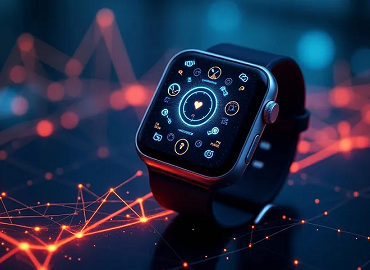
Designing UX for Wearable Devices
- Super User
Manoj Kumar
Imagine strapping on a fitness band in Delhi, and it tells you exactly when to hydrate — not just because your step count is high, but because it has sensed your body heat, local humidity, and your pace. That kind of “invisible insight” is what great wearable UX can offer. However, designing UX for wearable fitness devices in India and the globe presents its own set of challenges — including language diversity, varying literacy, power constraints, the local context of use (such as outdoor heat, variable light, and sweating), affordability pressures, and more.
However, designing UX for wearable fitness devices in India and the globe presents its own set of challenges — including language diversity, varying literacy, power constraints, the local context of use (such as outdoor heat, variable light, and sweating), affordability pressures, and more.
In this blog, I’ll share what I’ve learned (from projects, research, and mentoring learners) about designing UX for wearable fitness devices in India and across the globe. I’ll also show how UXGen Academy supports learners in mastering this domain — affordably and practically.
Let’s dive in.
1. Understand the Indian context: constraints, behaviors & expectations
To design anything that works in India, you must first understand what makes it different. Here are some realities to keep in mind:
Diverse user literacy and language: Many users may be comfortable in Hindi, Hinglish, or regional languages; English-only UI often excludes a large segment.
Lighting and outdoor use: Devices are used outdoors, in bright sun, on streets, in dusty or wet conditions. Contrast, bold typography, and quick glanceability become essential.
Battery and affordability pressure: Users expect devices to last days, not hours. They are sensitive to device longevity and maintenance cost.
Wear and sweat factors: Band design, waterproofing, skin irritation, glances during workouts — all matter.
Health literacy & trust: Some users may not fully trust health metrics or algorithms: transparency and explainability help.
Connectivity constraints: Not everyone has constant access to high-speed networks or a constant smartphone pairing.
To illustrate, a recent study, “Unpacking Personal Health Informatics in India,” found that usability challenges, mistrust in digital health platforms, and low health literacy hamper the adoption of wearable health systems.
So when designing, you can’t assume “user knows UX norms of best-in-class devices.” You have to simplify, teach, and reassure.
2. Key UX principles for wearables (with Indian market focus)
One exciting emerging idea: fatigue-aware adaptive interfaces for wearables. A recent 2025 study utilized deep learning on physiological signals to dynamically adjust UI elements (such as text size and notification rate) and reduce user fatigue. In tests, cognitive load decreased by ~18%, and satisfaction increased by ~22%.
That’s the kind of intelligent UX we should aim for. But you must balance “smart automation” with user control — never give the feeling: “ the device decided everything.”
Let’s translate universal wearable UX wisdom into the Indian context:
2.1 Glanceability & minimalism
Wearables demand glanceable designs: users look for 1–2 seconds, not dwell. Prioritize the most important metrics (heart rate, steps) on the home screen; hide advanced ones in a deeper section.
2.2 Context-aware UI
Your wearable should adapt:
In bright sun → high contrast mode
While walking → simplified UI with fewer steps.
During rest, → show deeper insights.
This adaptation maintains a functional yet energy-efficient UI.
2.3 Personalization & localization
Offer language options — Hindi, Marathi, Tamil, etc. Use icons + text (so even semi-literate users can infer meaning).
Allow users to choose which metric they want on the home screen (some might prefer blood oxygen over steps).
2.4 Feedback & micro-interactions
Tiny animations, transitions, and haptic feedback make the experience feel alive. For example, when you reach a goal, the device vibrates gently and displays a celebratory icon. However, always strike a balance between performance and battery life cost.
2.5 Battery awareness
Because batteries are small, reduce continuous sensor polling. Use event-driven triggers (e.g., motion-based wake), batch data transfers, and dim the screen when idle.
In one of my projects, switching from a 1-s heart-rate poll to 5-s increments reduced battery drain by ~15%.
2.6 Trust & transparency
Health data is sensitive. Add “confidence intervals” or “possible error range” for readings. If a reading seems off, explain “weak signal, please rewear the band tighter.” Let users override or calibrate.
This builds user trust.
2.7 Inclusive design
Use high-contrast modes, avoid tiny touch targets, and support gestures/voice where possible. Always test with diverse users, including older individuals, those with visual impairments, and those who are less tech-savvy.
3. UX Process: Your roadmap to wearable UX success
Here’s a refined process I use (and teach) — adapted to Indian constraints and leveraging 2025 trends:
1. User research & field empathy
Visit gyms, parks, and rural homes. Observe users wearing devices, sweating, and glancing at their screens.
Ask what health means to them, how much they trust device metrics.
2. Personas & usage scenarios
For example, Rohit, 32, runs in the Delhi heat; Radha, 50, walks daily in the city.
Map when, where, and how they’ll interact.
3. Define core metrics & task flows.
Decide 2–3 must-have screens (e.g., home, start/stop workout, alert).
Flow for setting a goal, notification, or alert.
4. Wireframes / low-fi prototypes
Use grayscale, test on actual wearable size mockups.
Simulate a glance through the prototype.
5. User testing & iteration
Ask users: “Start walk,” “See heart rate,” “Stop alert.”
Observe mis-taps, confusion, and readability under sunlight.
6. Hi-fi mock & micro-interaction design
Add transitions, haptics, and animated states.
Check the battery cost of these features.
7. Beta test with a small group & logs
Collect analytics: drop-off screens, error rates, battery logs.
A/B test small changes (icon layout, alert style).
8. Launch & continuous improvement
Use feedback and logs to tweak.
Push updates over time — show users you’re listening.
In 2025, we will introduce AI-assisted feedback, including real-time user sentiment analysis, pattern detection in usage, and predictive haptic prompts. Use AI tools to support, not replace, your UX judgment.
4. Challenges & trade-offs you’ll face
Let me share some real trade-offs I encountered on wearable projects and how I resolved them:
Battery vs. update frequency Frequent heart-rate updates improve precision, but they also drain the battery. I compromised by sampling more frequently during workouts and less frequently during rest.
User control vs. automatic behavior Too much automation (auto alert thresholds) may disempower users. I introduced a “manual override” toggle.
Language localization load Multi-language support increases app size and testing complexity. Prioritize top regional languages first (e.g., Hindi, Tamil) and allow users to download language packs later.
Overwhelming metrics
I once tried to show 10 health metrics on one screen — users got confused. I pared it down to 3, and offloaded the rest to the mobile companion app.
Trust issues with readings
Some users ignored heart-rate spikes, thinking the device was wrong. So I added “confidence level” or “range of error”, and textual hints (“possible sensor glitch, rewear band”).
These trade-offs are inevitable. The skill is in balancing and justifying them with data and user feedback.
5. Case story: how I mentored a learner to build a prototype
Let me share a quick story from my mentoring at UXGen Academy:
Get Manoj Kumar - UX Researcher’s stories in your inbox
Join Medium for free to get updates from this writer.
6. How UXGen Academy helps YOU master this topic
Live mentoring with Manoj (UX Expert Mentor)
Every alternate day, Mentor Manoj comes live to solve your queries (design, portfolio, case study, interview).
These sessions are recorded and shared — so if you miss one, you can revisit it at your convenience.
Manoj guides learners to polish their portfolio, refine case studies, and tailor wearable UX work.
Hands-on projects with real context
You’ll receive assignments such as designing a fitness band UX for runners in Delhi or rural markets.
We emphasize real user research (local context), testing, iteration — not just “make fancy UI”.
AI + human blend approach
In the AI era, we teach “smart learning”: using AI tools (e.g., for pattern analysis, prototype generation) where they are helpful — but relying on human judgment for empathy, nuance, and context.
You’ll learn how much human intervention is needed, and how best to use AI as your assistant, not a replacement.
Internship & production studio exposure
UXGen Studio (our in-house production arm) offers 2-month live internships to promising learners. You’ll work on client projects (or internal wearable UX tasks) under guidance.
This gives you real, resume-worthy experience.
Affordable learning & support
We believe in inclusivity. Our pricing is student-friendly. Installment plans, scholarships, peer mentorship — all built to make quality UX learning accessible.
You get community support, a library of case studies, curated resources, and templates — so you don’t reinvent the wheel.
In short, we don’t just teach theory; we walk with you in projects, mentor you in real-time, and connect you to live work.
Final thoughts & calls to action
Designing UX for wearable fitness devices in India is a challenging but advantageous path. You’re not just styling screens — you’re building trust, enabling health insights, and designing for real human conditions (heat, sweat, language, limited battery).